As I may have mentioned before, I’ve never really put much effort into Ben’s room. Well that’s not precisely true. We did FINISH OUR BASEMENT just so he could have his own room, which was Matt’s old office. But after all that was done (a good percentage we did ourselves), we just didn’t seem to have the energy to really DESIGN Ben’s room. So we re-assembled the crib, slapped up a few prints, brought in Tabby’s old dresser and called it good.
 So now that Ben is shedding the crib (apparently this is going to be a slow process), we are preparing to get rid of the crib (*SOB*) and really design him room. Our initial idea was a loft bed, maybe with a clubhouse sort of element, but Ben’s room has an AWESOME and very necessary ceiling fan that is cool looking but quite big. So loft bed=bad idea. The type of bad idea where you could get your head/limb sliced up. Of course it took our 6’7″ friend to point this out. Really tall people are useful like that.
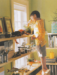
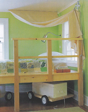
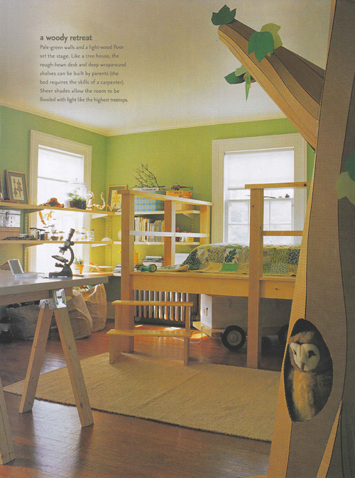
So, completely frustrated, we hung around Ben’s room for a while yesterday looking for inspiration. A plain ol’ bed just didn’t seem to suit and we were getting pretty frustrated. Then suddenly I remembered a magazine I stashed away 10 yrs ago (yes, 10). Back then, we were still in college and Matt’s uncle and cousins came to town for a while, sometime after their visit, I found a copy of (the now sadly defunct) Martha Stewart Kids’ magazine that they had left. I loved it immediately and purchased every issue (still have them all!). But in that first issue almost to the back was a feature on a great kid’s room – a treehouse. The bed was just elevated enough (2ft) to give it some height (not much more than the bed in our room and out of fan reach). The room had fun tree-house style details, like a tin-can light, a burlap canopy, simple shelves lined with tin cans and jars of crawly things, a saw-horse desk.
 I brought out the magazine and we looked it over and it just clicked. Everything about it feels right. The boyness of it, the playfulness of it, the simplicity of it. It even works with the owl prints he already has. Obviously, it won’t go up as designed. Ben has no use for a desk at this juncture and he will need some bookshelves (rain gutter) and some other storage, including a dresser (hello IKEA!). Also, we will move the color scheme a bit more into the browns and oranges for some more interest.
I can’t wait to get started on it. Of course first, he needs to be fully out of his crib. Also, we need to rip out the cabinets that are in there and lay down carpet underneath (hope our attic stock is big enough!). But I couldn’t help myself. I already bought some bedding. What? It was on sale!
Meanwhile, you can follow my Ben’s Big Boy Bedroom Pinterest board.


That room looks so awesome for a little boy! He’s going to love it!
Beautiful idea. Looking forward to seeing the final product whenever it will be. I am glad I am not the only one with a stash of favorite magazines.
LOVE IT! We used a very similar color for the Mini’s room (Ben Moore’s pear green, it’s AWESOME). Bright, but not overpoweringly so. I have to take pictures of his room once it’s finished. We got some cute car bedding from Ikea. I can’t wait to get rid of the carpet, but still, I love the way the room came out.